What makes a luxury bathroom exceptional?
Luxury Bathrooms: What Makes a Beautiful Bathroom Exceptional? Beautiful products may catch your eye, but what makes a bathroom feel truly luxurious is something far
Glossy crimson tiles and Samuel Heath brassware in City Bronze bring a completely different mood to the second bathroom inside this South East London home.
Inside this Victorian home in Herne Hill, two bathrooms were designed with completely different personalities.
The first bathroom is calm and understated, with soft stone, warm oak and brushed gold creating a relaxed family space. For the second bathroom, tucked beneath the roofline on the top floor, the design takes a much bolder direction.
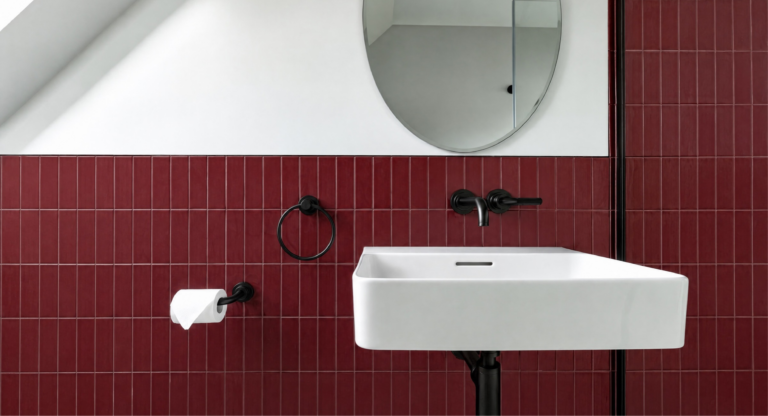
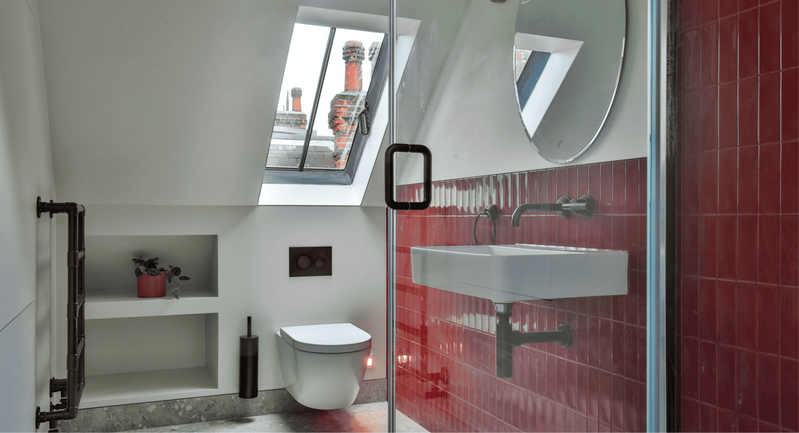
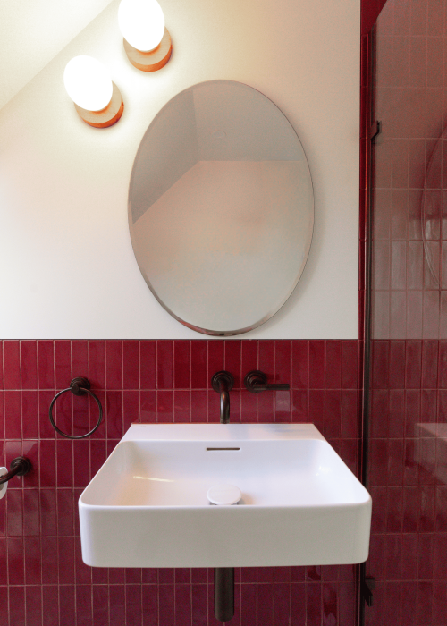
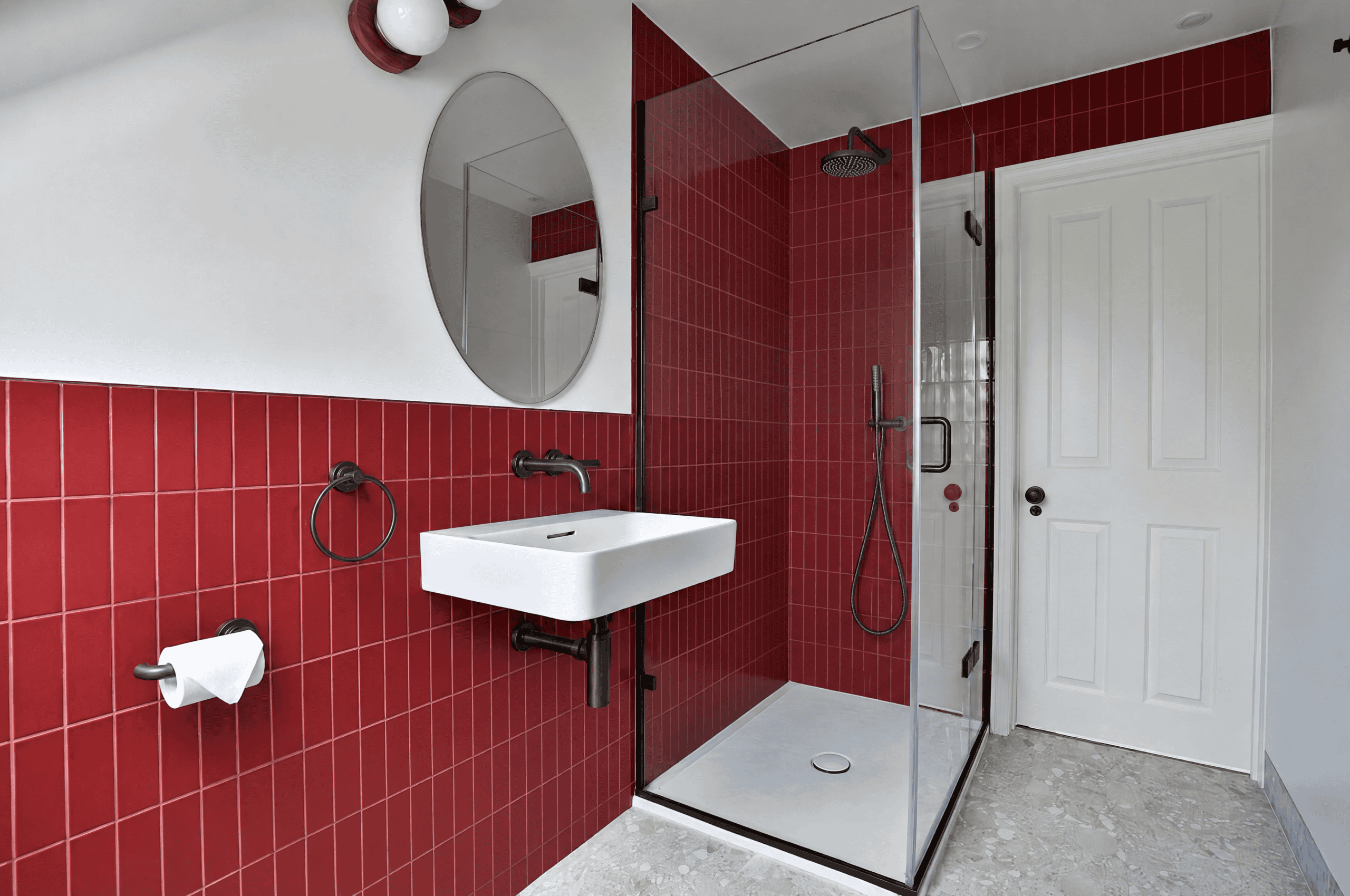
Here, glossy crimson tiles set the tone, bringing rich colour and character to the compact shower room. Samuel Heath brassware in City Bronze adds depth against the red, while crisp white sanitaryware, pale flooring and natural light from the skylight keep the scheme balanced.
Although very different in mood, the two bathrooms were designed as part of the same home. Rather than making them match, the aim was to give each room its own identity while introducing subtle details that connect the two spaces.
This second bathroom shows how bold colour, used with purpose, can transform a smaller space without overwhelming it.
The Victorian home already has a strong relationship with colour, so there was room to do something much bolder upstairs.
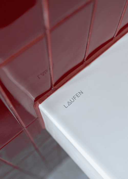
Rather than introducing crimson through smaller accents, glossy tiles give the colour real presence. Their narrow format creates a strong vertical rhythm, while subtle variations across the glazed surface stop the red from reading as one flat block.
Keeping the upper walls white gives the colour space to breathe. The white basin and sanitaryware do the same, while the pale stone effect flooring brings in a quieter surface underfoot.
It is a strong palette but every element does not need to compete for attention.
Against the crimson tiles, the brassware needed enough depth to hold its own.
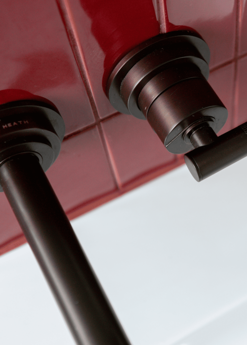
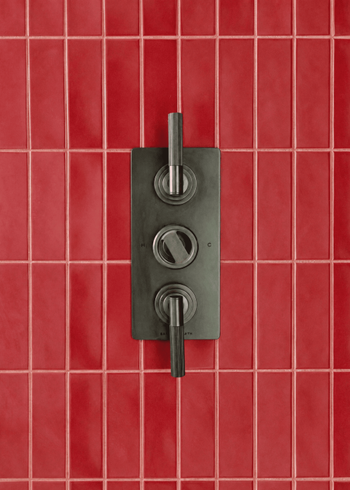
Samuel Heath Landmark Industrial brassware was specified in City Bronze, bringing a dark metallic finish to the basin and shower. Its distinctive linear detailing becomes particularly visible on the handles, introducing another layer of texture against the glossy tile.
The City Bronze works differently here to the warmer Matt British Gold used in the family bathroom below. It is darker and more pronounced, giving the crimson a stronger edge.
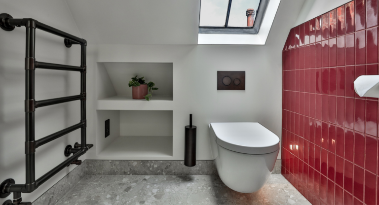
A Vogue Fairing towel warmer in Antique Brass introduces another metallic tone, while the Majestic Portofino shower screen continues the City Bronze detailing around the shower.
Samuel Heath has been manufacturing in Birmingham since 1820, with its brassware still made from solid brass and hand finished. It is exactly the kind of detail that rewards a closer look.
Inside the shower, the colour becomes more immersive.
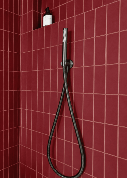
The same glossy crimson tiles continue across the walls, surrounding the rainfall shower, hand shower and concealed controls. A recessed niche is finished in the same tile, keeping storage within the wall rather than interrupting the surface.
The dark shower fittings create a sharp contrast against the red, while the clear Majestic Portofino screen allows the colour to remain visible from the rest of the room.
Rather than treating the shower as a separate area, it becomes part of the overall colour story.
There is another element shaping this bathroom: the room itself.
Set beneath the roofline, the space has sloping ceilings and a skylight that brings natural light directly into the room. Instead of fighting those angles, the layout works around them.
The basin and shower occupy the taller side of the room, while a wall hung Catalano Sfera WC sits beneath the lower roofline. Built in recessed shelving makes use of the wall beside it without introducing additional furniture.
An Origins Living Belvoir mirror follows the softer curves already found elsewhere in the room and gives the basin area a clean focal point above the crimson tiles.
The result makes use of an unusual top floor footprint without trying to disguise it.
For all their differences, there is one quiet connection between this bathroom and the family bathroom downstairs.
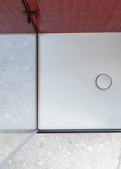
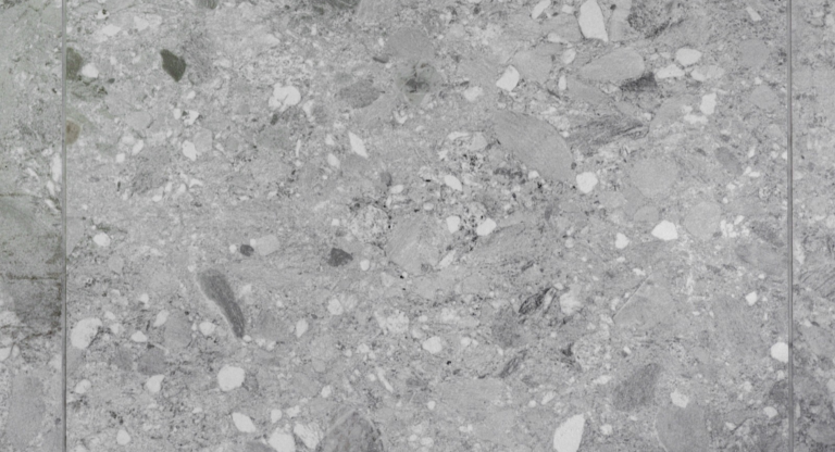
The same pale floor tile appears in both.
Here, its soft stone effect provides relief from the crimson walls. Downstairs, it sits naturally within a much calmer palette of stone, oak and brushed gold.
It is a small connection but an important one. The bathrooms were never designed to match. They simply needed to feel as though they belonged to the same home.
One is calm and understated. The other is bold, glossy and saturated with colour.
Together, they show just how different two bathrooms under one roof can be.
A bathroom this colourful does not need many competing elements.
The rectangular white basin cuts cleanly through the crimson backdrop. The Belvoir mirror keeps the wall above it simple. Dark brassware provides contrast, while the pale floor and white walls give the eye somewhere quieter to land.
That balance is what allows the red to be bold without overwhelming the room.
Sometimes the strongest bathroom schemes are not about adding more. They are about choosing where to make the impact.
Can you use dark red or burgundy tiles in a small bathroom?
Yes. Strong colour can work particularly well in a smaller bathroom when it is balanced with lighter surfaces. Here, crimson tiles are paired with white walls, sanitaryware and a pale floor, allowing the colour to make an impact without covering every surface.
What brassware works with red bathroom tiles?
Darker finishes can create a strong contrast against red and burgundy tiles. In this bathroom, Samuel Heath Landmark Industrial brassware in City Bronze brings depth against the glossy crimson surface.
Should all bathrooms in the same home match?
No. Bathrooms can have completely different personalities while still sharing small details. In this Herne Hill home, the two schemes use very different colours and finishes, but the same pale floor tile creates a subtle connection between them.
How can you use bold colour without overwhelming a bathroom?
Give the colour somewhere to stop. Keeping some walls and larger elements lighter can create visual balance, while repeating one strong colour across selected surfaces gives the scheme purpose.
Do Kallums Bathrooms design bathrooms in South East London?
Yes. We design and supply bathrooms for homes across London and Surrey, including Herne Hill and South East London, from our showrooms in Putney and Guildford.
This top floor shower room completes our two bathroom project inside a Victorian home in Herne Hill, South East London.
Through our bathroom design service, we can help you explore colour, materials and finishes with confidence, while planning the layout and selecting products that work together as one complete scheme.
Visit our Putney or Guildford showroom to explore tiles, brassware, showers and finishes in person and talk through your project with our design team.
Explore more projects in our case study collection.

Luxury Bathrooms: What Makes a Beautiful Bathroom Exceptional? Beautiful products may catch your eye, but what makes a bathroom feel truly luxurious is something far

A Bold Crimson Bathroom Inside a Victorian Home in Herne Hill Glossy crimson tiles and Samuel Heath brassware in City Bronze bring a completely different

How to Future-Proof Your Bathroom: 7 Design Decisions That Make a Difference A bathroom designed for today should still work beautifully years from now. A
Simply fill in the form to download a copy instantly